A Quick Look at Dreamweaver CS4 - Part 1
Part 1 |
Part 2 |
Part 3 |
Part 4 |
Part 5 |
Part 6
Preamble
September 18th 2008
I wrote this tutorial/chapter for a book that I was putting together for a major publisher. But then I decided that I rather just publish the text on killersites.com ... and so I skipped the book idea for now.
Thanks,
Stefan Mischook
Introduction
We are going to take a quick look at the changes to Dreamweaver CS4, specifically concentrating on the things related to working with PHP. At the same time, I may weave in a few nerd—concepts here and there, so that we can gently get you used to this stuff.
Dreamweaver CS4's user interface
When you first pop open Dreamweaver CS4, the global changes to the programs UI is obvious. Dreamweaver now has a whole new skin and the icons/buttons have been updated as well. Before I get into the PHP specific parts of the user interface, I want to point out a couple of interesting changes:
Adobe look and feel integration
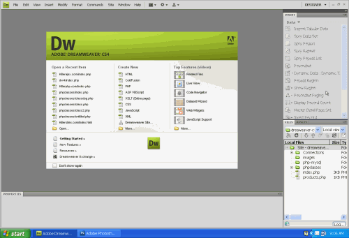
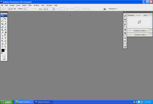
If you use any of Adobe's other products (Flash, Photoshop, Fireworks) you will immediately see that Adobe has put in a lot of work to give all the programs the same look and feel, and Dreamweaver CS4 is no exception.
Check out these screenshots of Dreamweaver CS4 and Photoshop:
Dreamweaver Screenshot

Photoshop Screenshot

Adobe's reasoning behind making all their programs looks and feel the same is simple: they want to make it easy for you to learn to use their software. By keeping things consistent, it is much easier to jump from one to another when you are both learning an Adobe software package and in your day—to—day work with Adobe products.
That said, I got me a feeling that they think this is also good for cross selling of their stuff — why use a competing program that has a different UI that you will have to learn? My conspiracy theory aside, it makes sense to keeps things consistent.
The new workspace drop—down—list
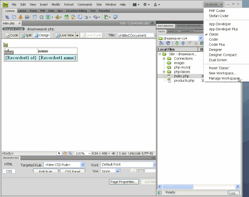
Ok, so the new UI is cool and all, but you're one of those old—school Dreamweaver nerds that just can't let go of the old UI that you love so much. No problem, with the new workspace drop—down—box, you can easily switch from the current default workspace to the classic workspace:
Screenshot of drop down list selecting classic view

Besides the 'classic' workspace, you probably noticed a whole bunch of other workspace options that instantly reorganizes the Dreamweaver user interface:
- App Developer
- App Developer Plus
- Classic
- Coder
- Coder Plus
- Designer
- Designer Compact
- Dual Screen
Each preset is self explanatory... for the most part.


 Subscribe to RSS


