Web Design
January 15, 2009
Hi,
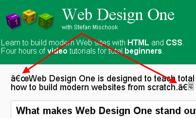
Have you ever loaded up a web page and found funny looking symbols in your text where there should just be normal text? Take a look at this screen capture:

Those funky symbols are appearing because you are using symbols (in your web page) that fall outside the normal character space range … you need to tell your browser you want to use international symbols.
To do this, you need to add the UTF8 meta tag:
<meta http-equiv=”Content-Type” content=”text/html; charset=utf-8″>
And this is what you will get:

Hope that helps.
Stefan Mischook
www.killersites.com
read more
January 14, 2009

Hi,
I’ve been using Paypal to process my credit card orders since 2001 and overall, it’s a pretty good service.
… In fact, I would argue that Paypal is essential for just about any e-commerce site since it is used by so many merchants and most importantly, just ordinary people.
Paypal’s main advantages are:
- Easy to set up.
- Can accept several types of electronic payments: credit card, e-checks and Paypal.
- Since Paypal is so well known, it will put your clients at ease. You’d be surprised at how nervous people still are of buying products online!
read more
January 8, 2009
Hi,
I’ve been a advocate of website templates in commercial web design for years now, because it saves the designer a lot of time and in saves the clients a good chunk of cash.
… There are occasions where from-scratch custom design makes sense, but for most web design projects, templates are a great solution – especially with a little customization to make it look unique.
How to use Templates in the Web Design BUSINESS process?
I was recently asked by a web designer how I would show clients the templates that are out there? Do you send them to a template site (free or commercial) or do you do something else?
read more
January 8, 2009
Hi,
This will be just a short post.
Someone recently wrote to me, frustrated about their web site, where the project seemed to never end … there was always something more to do. Basically, this person was wondering if they were up to being a web designer since they just couldn’t get it right the first time.
Web Design is an Iterative Process
The point of this quick little blog post is to remind you that web design is typically an iterative process. What I mean by that, is that a web site is oftentimes, built in stages where you ‘finish’ the design from a-z and then, you go back and polish the layout and the structure of the site in a second, third and sometimes even a forth pass.
… So don’t get too flustered if your site is not turning out exactly the way you want the first time you take a crack at it. Eventually, you will get it were you want it to be and then … it will be time to redesign again!
Stefan Mischook
www.killersites.com
read more
December 28, 2008
I’ve been critical of web design zealots for years now and have gotten into some pretty heated battles over what I would consider to be overly zealous interpretation and adherence to the all not-so-mighty Web Standards.
I don’t want to argue the issue again, but in a nutshell: I always felt it unwise to ignore the practical realities of the browsers actually being used in favor of the Web Standards. I argued that the Web Standards, though noble in thought, were not reflective of the reality on the ground. As such, I advised web designers (years ago) to pay much more attention to browsers that people used, rather than to the Web Standards and the W3C validator.
Heresy!!
“… When people start surfing the Web with the W3C validator, I’ll start testing my sites with it. In the meantime, I will test with IE and Firefox since that’s what people use!”
The forward compatibility myth and the Web Standards
One of the big arguments put forth by the Web Standards zealots was that if you follow the Web Standards, your pages would be “forward compatible” … your web pages would more likely render properly in web browsers that have yet to be created.
Well, recent evidence is showing me that these academic shills were wrong once again.
The PS3 web browser prefers tables!
Being a hardcore nerd, I went out and bought the best blu-ray player on the market: the PS3. One of the reasons I got the PS3, is that it is equipped with a web browser. Yes, I like to surf the Web on my big tv.
Anyway, what I’ve discovered is that the PS3 browser screws up only on ‘forward compatible’ Web Standard compliant web sites. Whereas with old school table based layouts – never a problem.
It seems to me that the fine people at Sony (like so many others) realized that there are hundreds of millions of pages that are built with old school techniques and that they better support them. One thing academic nerds can never understand: pragmatic business decision making. Instead, they are defenders of the faith and thus, are very dogmatic in their decision making.
… Reminds when IE7 came out and it broke all these ‘forward compatible’ websites because they were using CSS hacks rather than safe and sure (non standard) IE Conditional comments. Man, many CSS books had to be corrected and reprinted!
Conclusion
I think this post is best summed up by what one my assistants (and formally Web Standards zealot) said when he started actually having to produce web pages in the real life:
“It’s hard to believe that these zealots are actually building web sites!? … When you’re trying to follow the strict standards in real day to day work … it simply isn’t always practical.”
Happy new year!
Stefan Mischook
www.killersites.com
read more
December 10, 2008

When looking at building web pages for cellphones, you have to consider a few options these days. Why? Because it is a moving target.
Moving target … what the heck does that mean?! Read on nerds to learn!
Way back, a long time ago …
In the old days, cellphones were only able to read pages built with a language called WML. WML is short for: Wireless Markup Language.
WML is basically HTML for cell phones. Along with WML, the nerds in power also came up with a Javascript-like language for cellphones called WMLScript. I am mentioning WMLScript for no particular reason other than to be complete. Anyway …
read more
November 10, 2008

Now that we are entering into a recession, potentially the worst economic crisis since the great depression (!!), web designers are probably wondering if their jobs are safe?
… This all comes down to whether or not companies will be spending money on web design? The answer:
– Short term: they will spend less.
– Medium term: they will spend more.
My reasoning is based on my 18 years experience as a business owner and on my observations of the current market.
The Short Term
People are nervous now. They hear all the negative news and so they pullback on spending and wait to see what will happen. The REALLY nervous people out there load up on gold, guns and dried fruit … while most of us just rent a movie at Blockbuster and cut back on trips to Vegas.
read more
October 20, 2008

Paypal is a very familiar service that most Web citizens know well. But is Paypal the way to go if you want to process credit cards on your website?
Short answer: yes.
… But it ain’t perfect.
read more
September 29, 2008

Hi,
I’m a big fan of the Firefox browser; it’s fast, nimble and has a great plug-in architecture, that has made Firefox into a true tool for web designers. That said, Firefox has one big failing – it sucks on the Mac.
Yes, for reasons beyond the comprehension of this humble nerd, Firefox crashes like crazy on the typically ultra stable Mac OSX.
… It’s so bad in fact, that sometimes it feels like I’m using crash-crazy Mac OS 9!
What is the source of the Firefox problem?
I haven’t done any thorough testing, but it seems to me that the constant crashing has to do with the Firefox Javascript engine – it only seems to crash when I’m on a page that uses Javascript.
So if any of your Firefox developers happen to come across this post, please take a closer look at this glaring problem. Believe me, I am not the only one who has seen this.
PS: The Flash player also doesn’t work properly in Firefox on Mac.
Thanks,
Stefan Mischook
www.killersites.com
www.killerphp.com
read more
September 13, 2008
If you’ve been struggling with CSS based page layouts (as apposed to using tables) and you’ve been smacking your head against the wall to get things to work … believe me, you’re not the only one!
No, you’re not stupid … CSS for page layout is.
What?! CSS is flawed?
Indeed. CSS for page layout sucks hard because the logic behind CSS page layout is weak at best, and perhaps, even flawed. I can say this with experience in other languages like Java and even VB. Not that I am saying CSS is a programming language.
Anyway …
For web designers used to the craziness of CSS layouts, they would be flabbergasted at how easy creating layouts/views/screens are in VB or even Java when compared to CSS.
What’s the main problem with CSS?
read more


